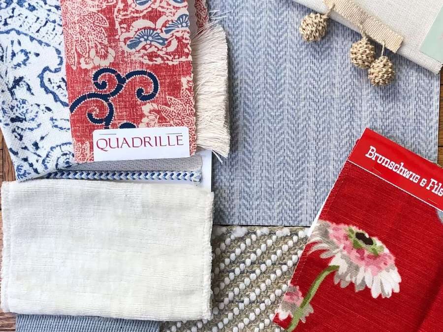
Color is the thing clients are most anxious about and the thing designers are most confident about, which creates an interesting dynamic in the early stages of a project. Clients often arrive with strong feelings about what they don't want — no beige, no gray, nothing that looks like a hotel — and less clarity about what they do want.
The palette conversation is really a conversation about mood. What do you want to feel when you walk into this room? Warm or cool? Enveloping or open? Serious or playful? The colors follow from the answers to those questions, not the other way around.
The palette I return to most often is built around a warm neutral — not quite white, not quite cream, something in the range of old linen or aged plaster — with two or three deeper tones that anchor the furniture and a single color that surprises. That color might be a celadon blue on a ceiling, a tobacco leather on a chair, or a deep green on a single wall. Its job is to make everything else make sense.